Data Visualization: attribute types and their graphical elements
June 9, 2021There are two main types of data: categorical and ordered. From all the graphical elements that can be used to present data visually, some are naturally best fitted for categorical data and some others for ordinal data.
By identifying your data types and using the right graphical elements to display them, you can communicate information in a clear way.
Data types are not mutually exclusive, nor restrict you from using a numeric value as a nominal quantity, but they allow you to categorize the data and better understand what visual representation of the data set will be useful.
Categorical Data
Data is categorical when you can define discrete categories or "buckets" to group items in the data set. Examples are:
- Day of the week or year can be used to group dates.
- Book genre can be used to group a set of books.
- Nationality can be used to group people.
Categorical data is also called nominal or qualitative data.
Categories can only distinguish whether two things are the same or different (eg: apples versus oranges) so the only mathematical operation you can perform between two cagtegorical attributes is equality, ie: is A == B?
Categorical data often has a hierarchical structure, for example:
- A temporal attribute can be categorized by year, month or day.
- A geographical attribute can be categorized by continent, country or state.
Ordered Data
Ordered data has a natural rank that can be used to compare items in the dataset, it allows you to ask is A < B?
The naming might be a bit confusing, but Ordered data can be further divided into Ordinal or Quantitative.
Ordinal data has an intrinsic order without necessarily being numeric, good examples are sizes of clothing (Small < Medum < Large), mood, socio-economic status, etc.
Quantitative attributes on the other hand, are numeric, therefore in addition to having an order order they also support mathematical operations like difference or ratio.
The graphical elements
A lot of amaizing work has been done figuring out what is the best way to present data with graphics. There are two main components working together to convey information:
- the shapes used to visualize the data, called
marks. Dots, lines and areas are good examples of marks. - the attributes that shapes can have, called
channels. Color, position and texture are good examples of channels.
There's an inherent relationship between data types and the different channels, some channels are naturally better at conveying nominal data (eg: hue, shape) and others are best to convey ordinal data (eg: size, saturation).
While some channels are naturally better than others to display certain data types, there isn't a hard rule for any pair, some channels are OK at showing categorical and nominal data as well, or sometimes the line is fuzzy and you must choose what is best for the visualization at hand.
Let's take a look at some well defined marks and channels along with some examples.
Position & Spatial Region
A great example that portrays position used to compare ordered data and spatial region to distinguish between categories is a bar chart:
Example: Cumulative confirmed COVID-19 cases per million vs. GDP per capita
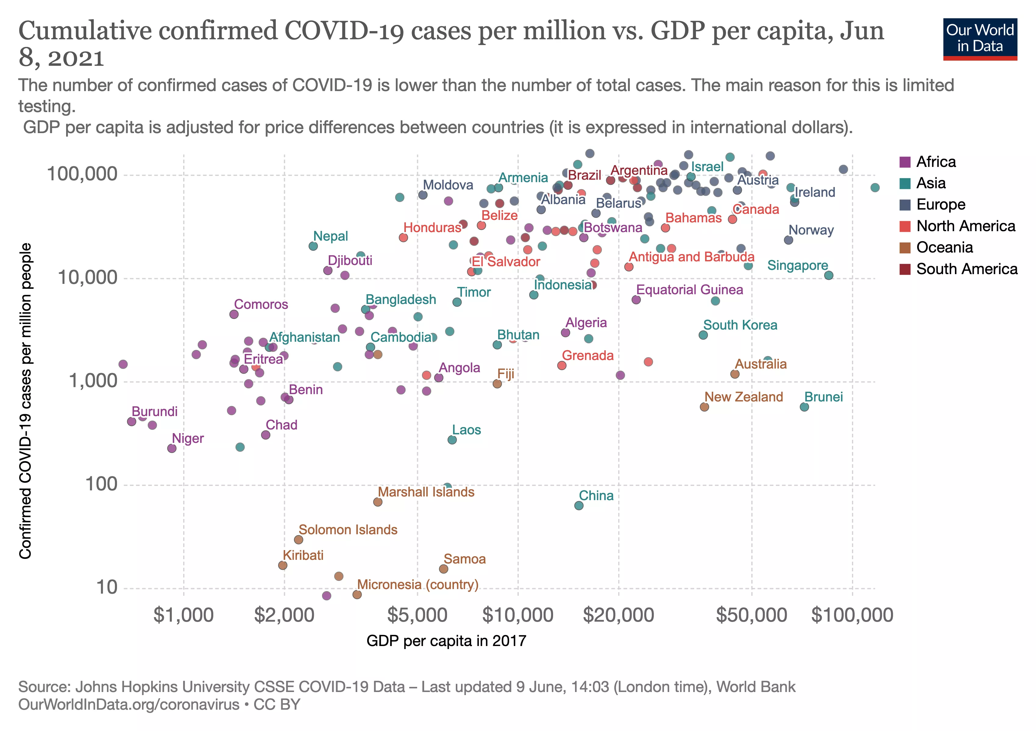
A scatterplot chart uses the position channel to compare two ordered attributes. The position of each point depends on the correlation between the values on both axes.
This chart also makes use of hue to group countries by category.
Example: Where Are America’s Winters Warming the Most? In Cold Places.
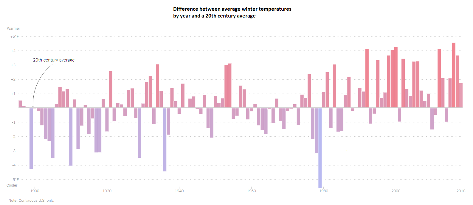
This chart makes great use of position and spatial region to show differences in temparatures across a time period.
Size
Size is a good fit to display Quantitative data, it allows the viewer to easily compare different magnitudes side by side. As you can see in the examples below, size is usually combined with hue to convey both category and magnitude together.
Example: Share of men vs. share of women who drank alcohol in 2010
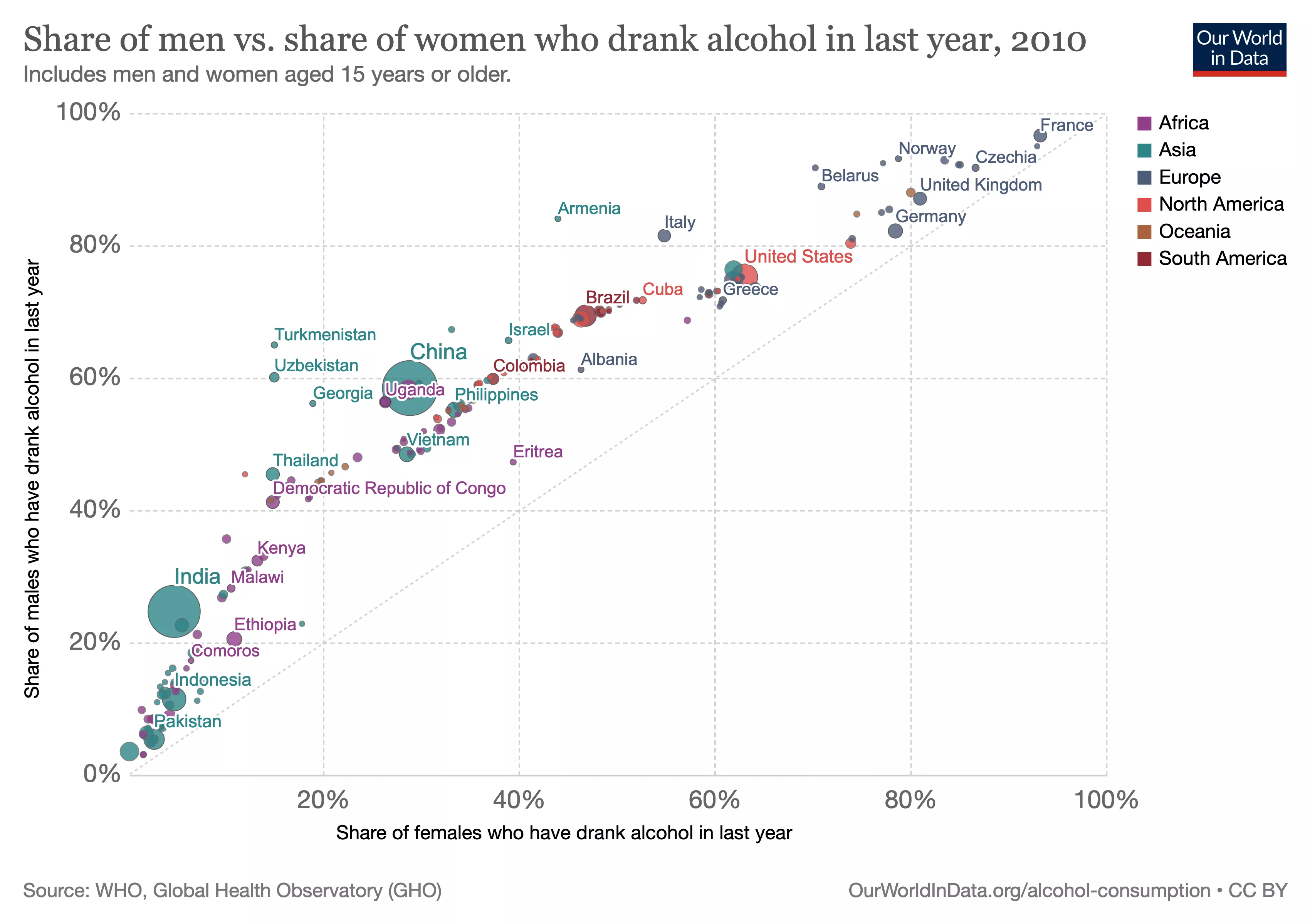
This Scatterplot Chart makes use of size as an additional channel to convey extra information, at glance we can see the relationship between the values in both axes and also compare how many people drank alcohol between the different countries.
This chart also makes use of hue to group countries by category.
Example: The Words Men and Women Use When They Write About Love
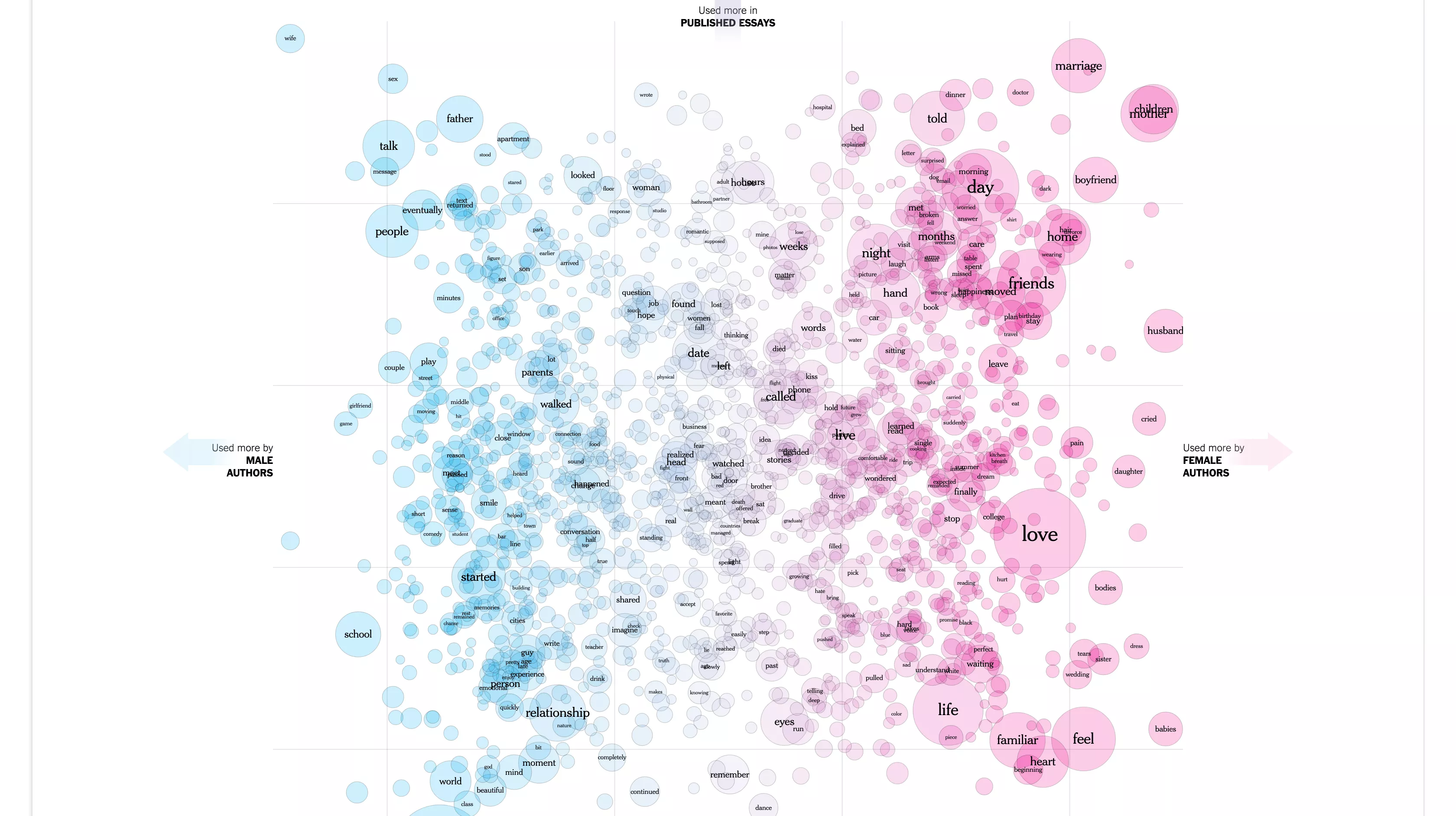
This chart is very similar to a Word Cloud, it conveys the frequency of usage of different words by the area (2D size) of each circle.
Hue is also used to separate the circles in two categories.
Hue
Hue is great to display categorical data, two shapes with different colors side by side immediately convey to the viewer that they belong to different categories.
Example: Outdoor air pollution deaths by age, World, 1990 to 2016
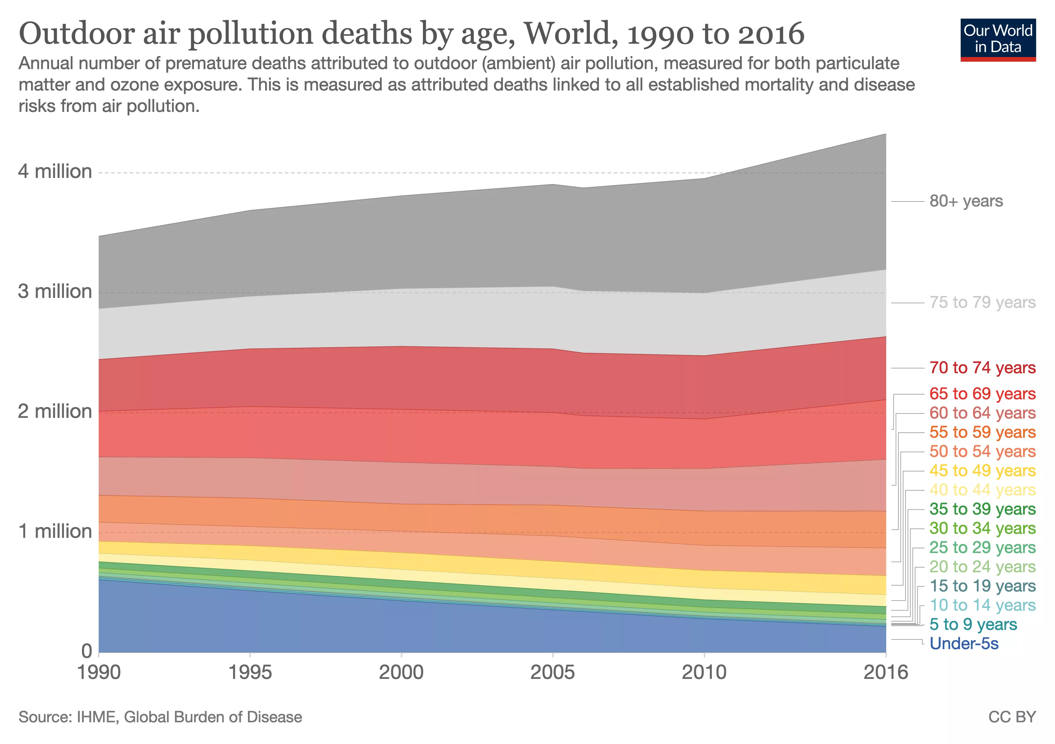
In this chart, different hue values are used to convey different categories of age ranges.
The size of each band plus the stacking the different colors allows to easily compare and identify trends between categories over time.
Example: Does livestock antibiotic use exceed suggested target?

Hue is used in this chart along with geographic information to convey three different categories. The use of different hue values allows to easy pinpoint areas with high consumption of antibiotics.
Luminance and Saturation
Luminance and Saturation are a good fit for quantitative data, when comparing items side by side an item with more saturation will convey "more" of the value it represents.
Example: GitHub contributions heatmap
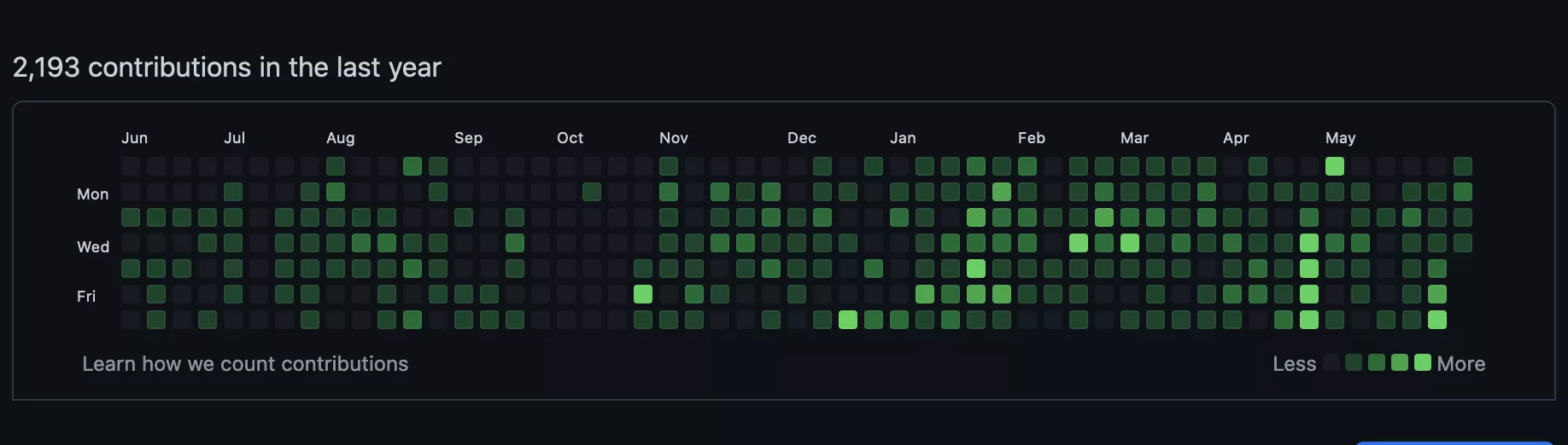
In this graphic we can see two categorical variables (day of the week vs month) and the use of luminance to convey an ordered attribute (number of contributions). The rectangles get brighter when the number is higher.
Example: Disability-adjusted life years (DALYs) from particulate pollution
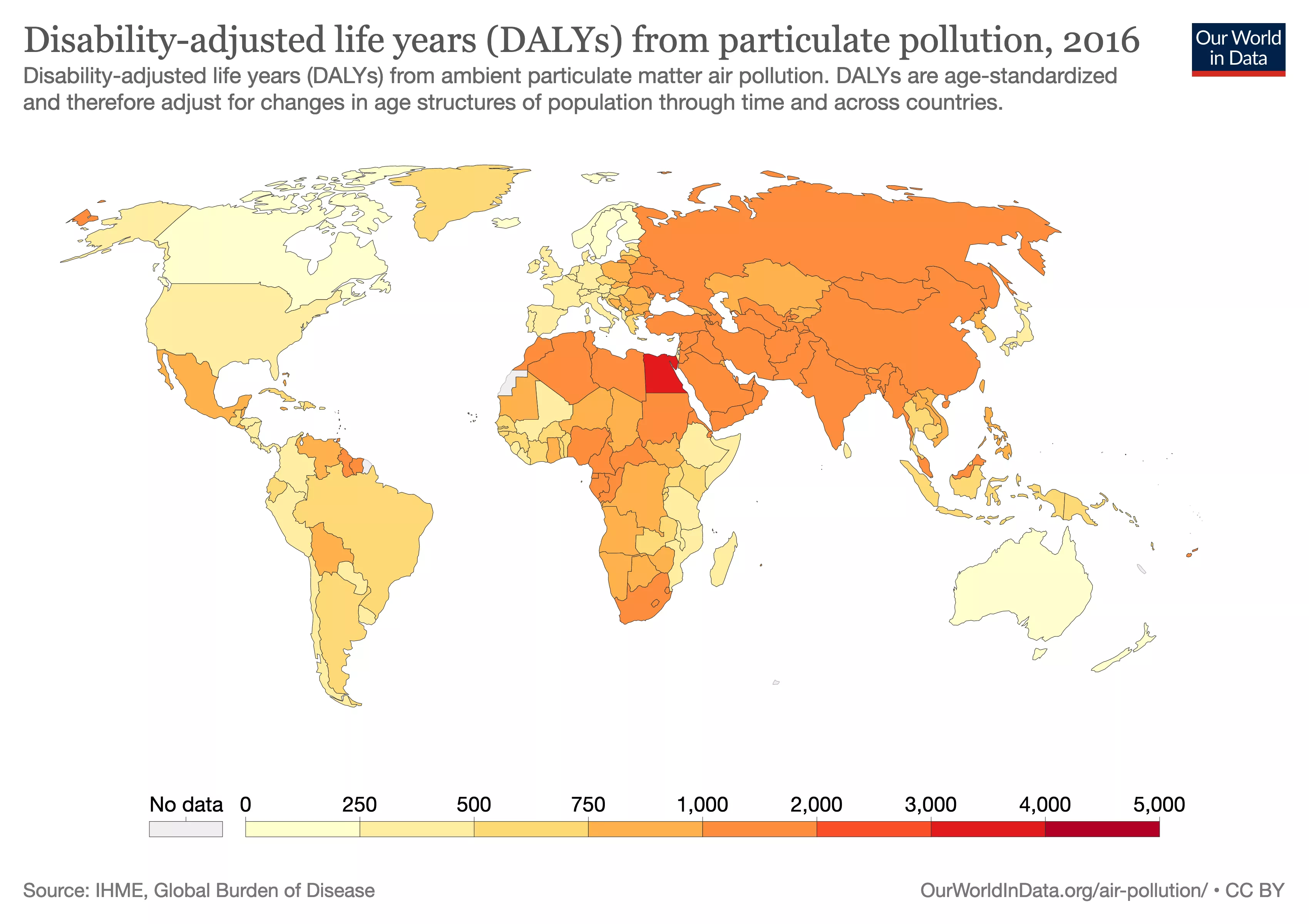
Luminance and saturation play very well with geographic data, allowing you to see geographic hot-spots easily.
Motion
When used carefully, motion can be a great channel to convey information, motion is good at displaying the passage of time and periodicity.


Angle
Angles can be used to express quantitative data, and are often used to show the magnitude of change of something.


Shape
Shape is often used for categorical data, as we naturally tend to group things that have the same shape together as belonging to the same group.


Choosing the right elements
The problem of what are the best marks and channels to convey your analysis of a given data set has been explored for some time now, from Jackes Bertin's Semiology of Graphics which was written in 1967, passing by Leland Wilkinson's Grammar of Graphics and some of Edward Tufte's work and many others including many papers from the UW Interactive Data Lab, some of them even exploring computer generated visualizations based on this principles.
At the end of the day, it's a balance of matching the right channel with the right data type and picking the most effective channel.